An Impassioned Plea to Consider Housing and Transportation Costs Together
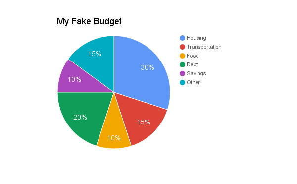
There are a lot of rules of thumb, guidelines, and pie charts out there to propose a basic, default American budget. For example: The above budget guideline pie is fake, but it's a representative amalgam of a bunch of similar pie charts I've seen thrown around. Budgeting aficionados like me often scoff at these as useless because it's like trying to apply a rule of thumb to "what should you spend your time thinking about?" It depends on who you are and what you want out of life!
But I get it, I do. If you are just starting out on your budgeting journey and you don't know how much things should and do cost, you need guidance to tell if your expenses are reasonable for your income. You need to know the baseline before you can consciously decide to deviate from it. And a budget that's based on percents, rather than dollar costs, naturally takes into account the differences between different cost-of-living areas (you'll spend more in NYC than Indiana, but you'll also make more).
Still, these budgets make some sweeping assumptions about the way the typical person lives. Specifically, they assume that everybody lives in the suburbs. I get that idea from the housing and transportation pie slices. I live in Boston, which is reputed to be an expensive city housing-wise, and I feel like I need to spend more than 30% on housing to get a nice place. Yet, there's no way I could begin to spend 15% of my income on transportation. It's just too much. I spend about 1% of my income on transportation. My wife and I each get a subway pass; that's our transportation budget. In order for me to spend less on housing, I'd have to move out of the city, but then my commute costs would skyrocket. Then, I'd be more in line with the pie chart.
The H+T Index provides housing and transportation costs for U.S. cities and towns. Here's what I found when I entered in several sample U.S. cities and towns of different sizes:
Location
|
Population (2013)
|
Median Income
|
Housing %
|
Transport %
|
H+T%
|
Boston, MA
|
645k
|
$73,180
|
33%
|
8%
|
42%
|
Chicago, IL
|
2.7m
|
$61,156
|
29%
|
15%
|
44%
|
Davenport, IA
|
102k
|
$51,151
|
24%
|
23%
|
48%
|
Detroit, MI
|
689k
|
$51,844
|
22%
|
21%
|
43%
|
Hope Hull, AL
|
3.3k
|
$47,290
|
19%
|
29%
|
48%
|
Idaho Falls, ID
|
58k
|
$50,841
|
23%
|
25%
|
48%
|
New York City
|
8.4m
|
$66,285
|
44%
|
5%
|
49%
|
Longmont, CO
|
90k
|
$67,956
|
24%
|
19%
|
43%
|
Wolhurst, OH
|
1.2k
|
$41,192
|
21%
|
30%
|
51%
|
You can see how much housing and transportation vary when I plot them independently. (In the charts, I ordered the towns by population, from smallest to biggest.)
In fact, they appear to be roughly mirror images! The same data plotted as a stacked area chart shows how they work together to create a reasonable stable total.
Individually, housing and transportation costs vary a lot depending on where you live, but taken together, housing-and-transportation is remarkably static across these very varied places: it's almost always between 45% and 50%.
(Interesting quirk: this index puts Boston's housing percent at 33%, which flies in the face of my "30% is NOTHING" assertion! Do I have high housing standards?)
The bottom line is this: When evaluating your or someone else's budget, consider the combined housing and transit costs. H + T below 45% or so is reasonable, regardless of how much is housing and how much is transportation.
Thanks to the Practical Cranberry Nut Roll for pointing me at the H+T Index.
Comments
Post a Comment