Profiles in Color Palettes: True Summer
I've talked several times about my Color Revolution and becoming a total convert to the idea of seasonal color palettes. I'd like to do a series on individual palettes, but the color palette I am most familiar, by far, with is my own, True Summer. I'm hoping to branch out and altruistically learn some other palettes so I can give good advice to others, but in the meantime, here is True Summer, and I invite other color-philes to write guest posts on their own color palettes!
DISCLAIMER: I'm writing from my own experience--I think I'm a pretty solid middle of the road True Summer--but color palettes is definitely more of an art than a science and your particular best colors may vary from mine. It's definitely possible that you came up True Summer in the Truth is Beauty color quiz and you look great in Amethyst, where I find the color meh at best on me. Or maybe you are somewhere between True and Soft summer, or True and Light summer, or True Summer and True Winter. So, while you can start with this as a guide, there is definitely scope for doing your own experimentation.
How do I know if I'm a True Summer?
- If you don't look good in black or white
- If you don't look good in any shade of orange
- If your best neutrals are gray or navy
- If you can rock mint green
- If you look better in clear tones than gray-ish tones; e.g. better in hot pink than dusty pink, better in sky blue than slate blue
What is the True Summer palette like?
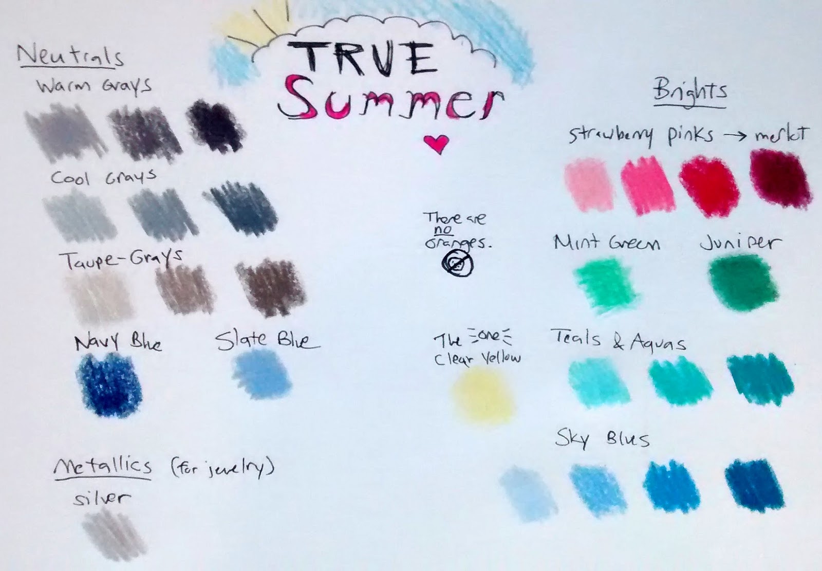
The True Summer color palette is dominated by blues and blue-greens, with a healthy dose of pink. These are bright, clear colors with cool (blue-ish) undertones. Think bold pastels; My Little Pony colors. I was afraid I'd look like an overgrown child in these colors, and maybe if it was the wrong palette for you, you would; but when your colors work for you, they work, and they just look good and natural on you.
I'm more of a verbal than a visual person, so in addition to consulting palette images, I've had plenty of practice memorizing color words that make good online searches. These are not used uniformly (one catalog's "spruce" might be too yellowy for a True Summer, where are another's might be that perfect blue-toned dark green), but are often helpful search words.
Grays: charcoal, dove, fog, pewter, slate
Most grays will work. Crisp, bold hues are better than subtle heathers, and medium tones are better than very whitish or very blackish shades.
Browns: taupe
Not a lot of browns on palette. Grayish browns can work; avoid tan or chocolate brown.
Purples: haze, periwinkle
Avoid robust purples like eggplant which are more Winter shades, and pastel purples like lavender which are more for Springs. A hazy, bluish shade is the only tried and true True Summer purple that I have found.
Blues: azure, Bali, Caribbean, cerulean, denim, indigo, midnight, mist, navy, sky
While not terrible, I tend to avoid jewel-tone blues like sapphire and violet blue, which are more on the Winter palettes.
Blue-Greens: aqua, aquamarine, beryl, pool, sea, teal, turquoise
Hard to go wrong with blue-green. The only pitfall is a grayish shade, which would veer into Soft Summer territory.
Greens: mint, jade, juniper, seafoam, spruce, tourmaline
Avoid greens that are yellowy, like lime; or brown/gray, like olive or pea green. Dark greens can be tricky as they're all named after evergreen trees; again, avoid the yellowy ones and sticky with bluey ones. Middle-of-the-road greens like emerald and grass green are neither great nor terrible.
Yellows: There is exactly one yellow on palette, which is very clear with almost blue undertones and usually only found in a pale shade. There is not specific word for it. Sometimes it's called "pale yellow", "light yellow", or "sunshine."
Yellows that are most likely NOT your shade include canary, lemon, neon, goldenrod, and pretty much any other yellow keyword.
Oranges: There is no such thing as a True Summer orange.
Reds: merlot, wine
Avoid brights like crimson and warm dark reds like terra cotta. Stick to "blue-ish" reds.
Pinks: hot pink, fuschia, magenta, rose, raspberry, strawberry
Pink can be tricky. Anything orangey, like coral or salmon, is right out. Most shades of pink will work fine, but a few bold shades will be fantastic. I haven't quite figured out why. Although most colors in the palette are best when blue-er, I haven't found that purpley pinks or neon pinks are particularly good; rather, warmer pinks like the inside of a strawberry work best for me, for unclear reasons.
What natural materials work in the True Summer palette?
Metals: silver
Stones: agate (pink or blue), beryl, blue topaz, jade, lapis, opal, rose quartz, sea glass, tourmaline, turquoise
Fabrics/dyes: indigo

Comments
Post a Comment